Pickle
Logo, packaging design, iconography, and art direction for Pickle, a healthy food delivery service based in Manila, Philippines.
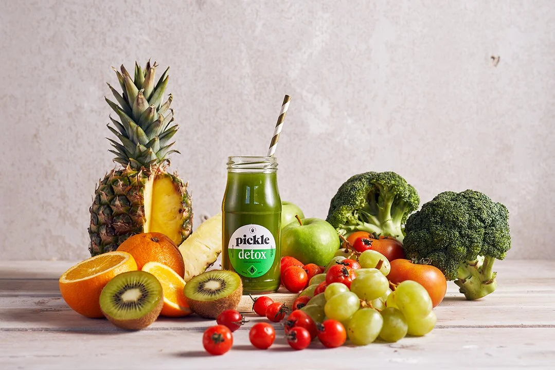
Photographer: Gabby Cantero
I selected the hefty yet elegant typeface Grouch for Pickle’s logo—it has a great contrast to the brand’s offbeat and cheeky name. I paired it with Sofia Pro, a geometric sans serif with a warm and bright personality.

For the brand’s secondary typefaces, I chose New Spirit and ITC Clearface for their chunky, retro feel.


I designed a series of icons that could be positioned next to the logo in a variety of ways, creating a playful and dynamic branding system.


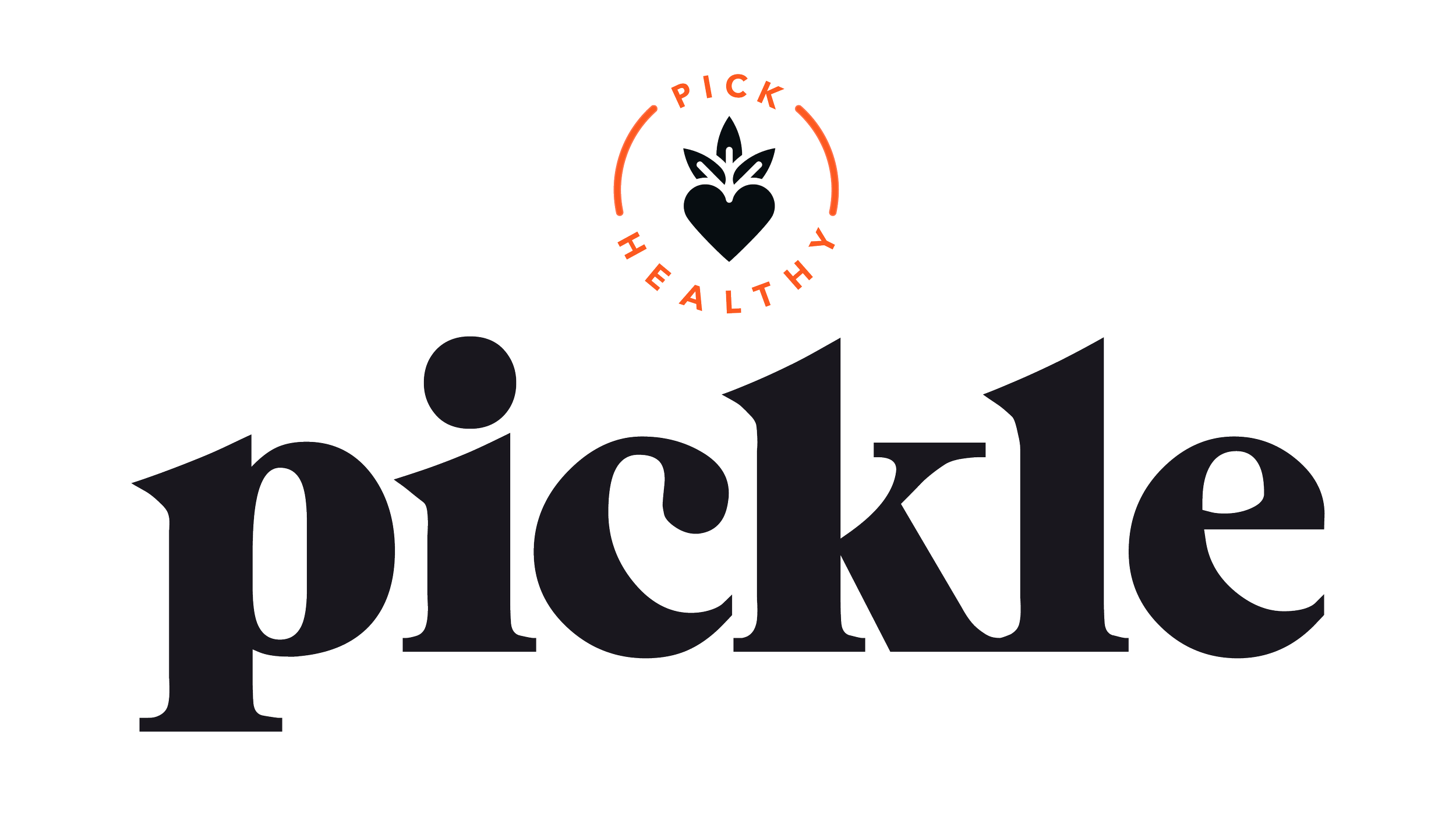

Two icons in particular combine a heart and a carrot—funnily enough, the client requested for no pickles(!) of any sort in the brand visuals—symbolizing how healthy eating with Pickle can be fun and enjoyable.

I kept the main color palette warm and simple to appeal to Pickle’s target upper middle class demographic. I peppered the secondary color scheme with bright hues that remind me of fruits and vegetables.

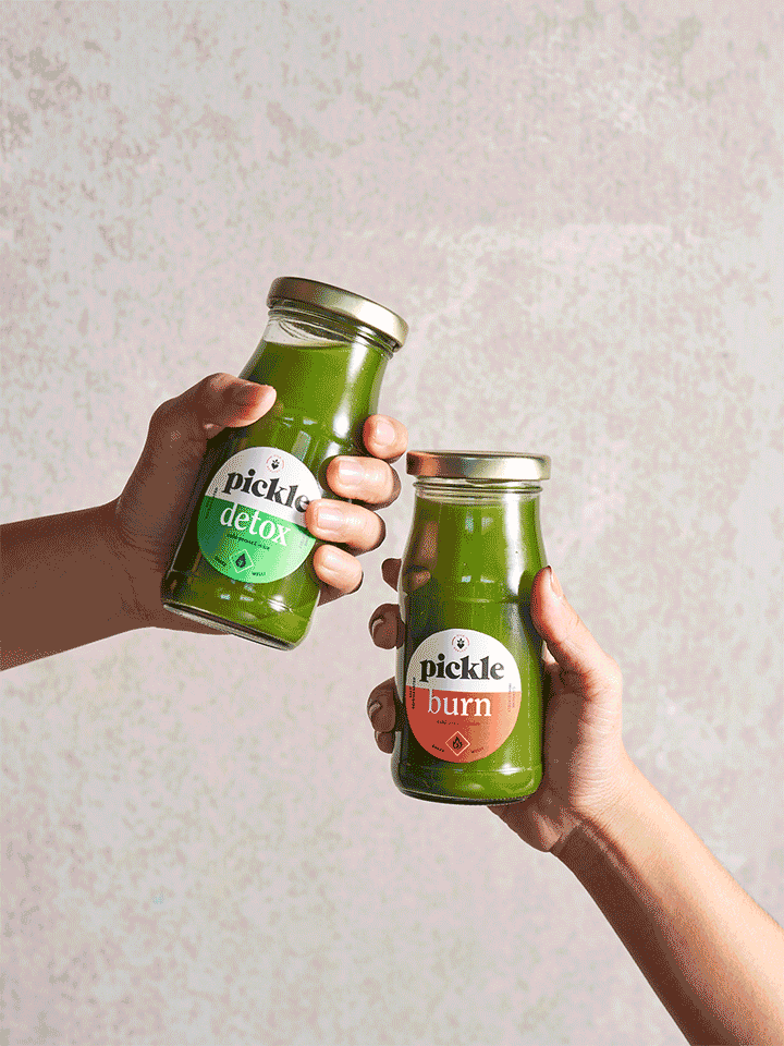
With the typography and color foundations in place, I designed the packaging for Pickle’s signature cold-pressed juices…


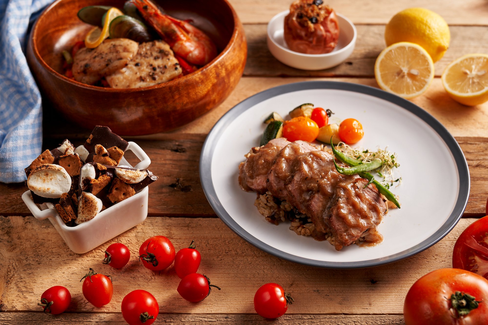
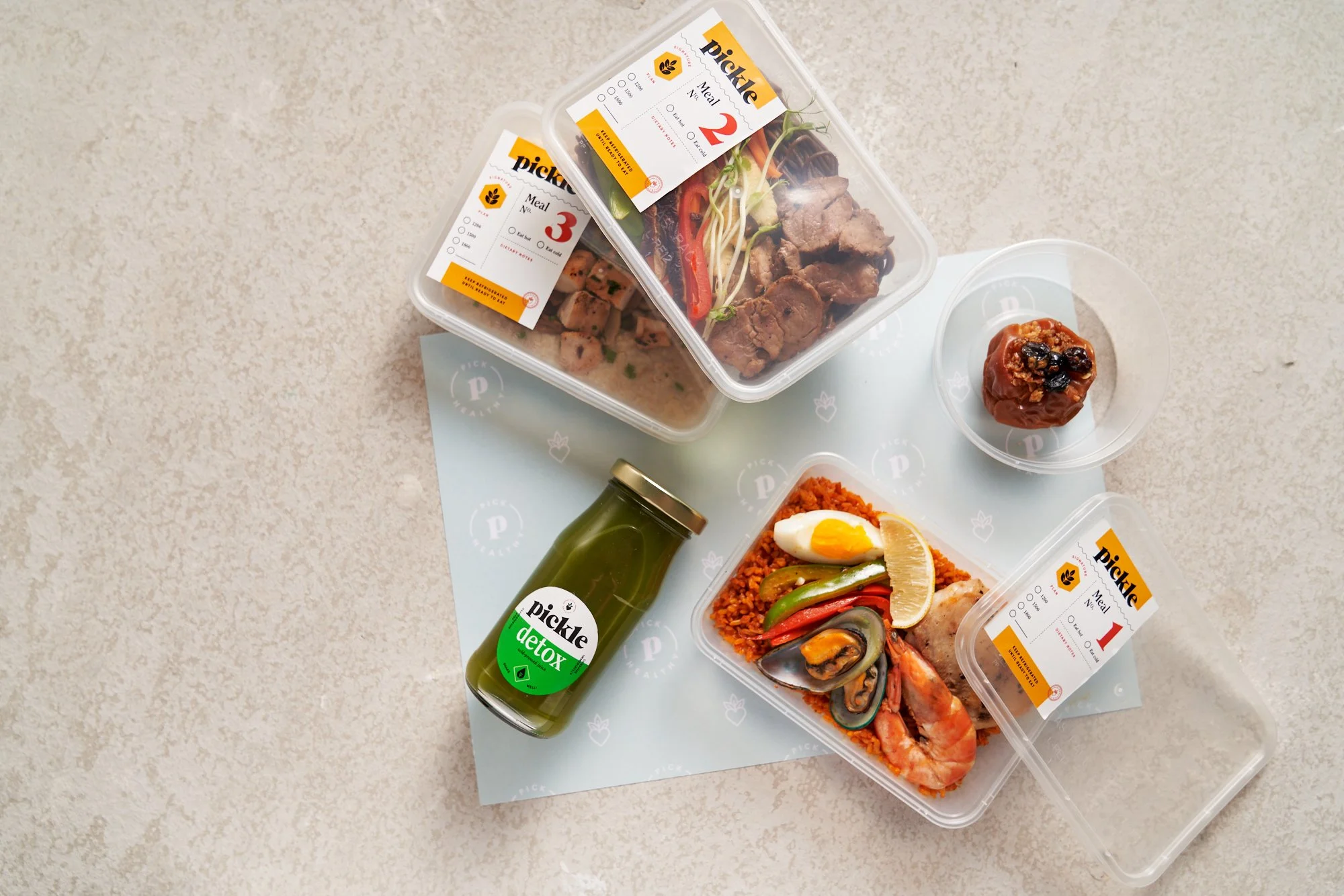
… and some stick-on labels for Pickle’s ready-to-eat home delivery meal plans.


I designed a set of icons that were applied to print materials and infographics.

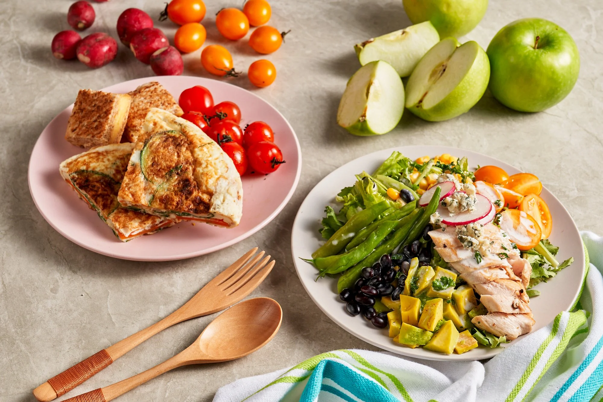
I art directed the product shots, ensuring that each meal plan had a distinct look and feel.

And finally, I created some templates for Instagram.


Happy eating!